Plotting Tutorial - SEDs
So you’ve run a model with SEDs and/or images and you now want to plot them. You now want to make plots of these from Python. The plotting library used in this tutorial is Matplotlib but there is no reason why you can’t use another. The examples below get you to write Python scripts, but you can also run these interactively in python or ipython if you like.
The tutorial here assumes that you are using the Model for post-processing tutorials.
An introduction to Matplotlib
Before we start plotting SEDs and images, let’s see how Matplotlib works. The first thing we want to do is to import Matplotlib:
import matplotlib.pyplot as plt
In general, if you are plotting from a script as opposed to interactively, you probably don’t want each figure to pop up to the screen before being written out to a file. In that case, use:
import matplotlib as mpl
mpl.use('Agg')
import matplotlib.pyplot as plt
This sets the default backend for plotting to Agg, which is a non-interactive backend.
We now want to create a figure, which we do using:
fig = plt.figure()
This creates a new figure, which we can now access via the fig variable (fig is just the variable name we chose, you can use anything you want). The figure is just the container for anything you are going to plot, so we next need to add a set of axes. The simplest way to do this is:
ax = fig.add_subplot(1,1,1)
The arguments for add_subplot are the number of subplots in the x and y direction, followed by the index of the current one.
The most basic command you can now type is plot, which draws a line plot. The basic arguments are the x and y coordinates of the vertices:
ax.plot([1,2,3,4],[2,3,2,1])
Now we can simply save the plot to a figure. A number of file types are supported, including PNG, JPG, EPS, and PDF. Let’s write our masterpiece out to a PNG file:
fig.savefig('line_plot.png')
Note
If you are using a Mac, then writing out in PNG while you are working on the plot is a good idea, because if you open it in Preview.app, it will update automatically whenever you run the script (you just need to click on the plot window to make it update). When you are happy with your plot, you can always switch to EPS.
Our script now looks like:
import matplotlib as mpl
mpl.use('Agg')
import matplotlib.pyplot as plt

fig = plt.figure()
ax = fig.add_subplot(1,1,1)
ax.plot([1,2,3,4],[2,3,2,1])
fig.savefig('line_plot.png')
Plotting SEDs
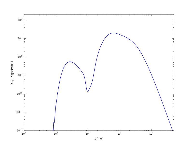
We are now ready to make a simple SED plot. The first step is to extract the SED from the output file from the radiation transfer code. This step is described in detail in Post-processing models. Combining this with what we learned above about making plots, we can write scripts that will fetch SEDs and plot them. For example, if we want to plot an SED for the first inclination and the largest aperture, we can do:
import matplotlib as mpl
mpl.use('Agg')
import matplotlib.pyplot as plt

from hyperion.model import ModelOutput
from hyperion.util.constants import pc

# Open the model - we specify the name without the .rtout extension
m = ModelOutput('tutorial_model.rtout')

# Create the plot
fig = plt.figure()
ax = fig.add_subplot(1, 1, 1)

# Extract the SED for the smallest inclination and largest aperture, and
# scale to 300pc. In Python, negative indices can be used for lists and
# arrays, and indicate the position from the end. So to get the SED in the
# largest aperture, we set aperture=-1.
wav, nufnu = m.get_sed(inclination=0, aperture=-1, distance=300 * pc)

# Plot the SED. The loglog command is similar to plot, but automatically
# sets the x and y axes to be on a log scale.
ax.loglog(wav, nufnu)

# Add some axis labels (we are using LaTeX here)
ax.set_xlabel(r'$\lambda$ [$\mu$m]')
ax.set_ylabel(r'$\lambda F_\lambda$ [ergs/s/cm$^2$]')

# Set view limits
ax.set_xlim(0.1, 5000.)
ax.set_ylim(1.e-12, 2.e-6)

# Write out the plot
fig.savefig('sed.png')
This script produces the following plot:
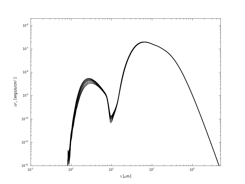
Now let’s say that we want to plot the SED for all inclinations. We can either call get_sed and loglog once for each inclination, or call it once with inclination='all' and then call only loglog once for each inclination:
import matplotlib as mpl
mpl.use('Agg')
import matplotlib.pyplot as plt

from hyperion.model import ModelOutput
from hyperion.util.constants import pc

m = ModelOutput('tutorial_model.rtout')

fig = plt.figure()
ax = fig.add_subplot(1, 1, 1)

# Extract all SEDs
wav, nufnu = m.get_sed(inclination='all', aperture=-1, distance=300 * pc)

# Plot SED for each inclination
for i in range(nufnu.shape[0]):
    ax.loglog(wav, nufnu[i, :], color='black')

ax.set_xlabel(r'$\lambda$ [$\mu$m]')
ax.set_ylabel(r'$\lambda F_\lambda$ [ergs/s/cm$^2$]')
ax.set_xlim(0.1, 5000.)
ax.set_ylim(1.e-12, 2.e-6)
fig.savefig('sed_incl.png')
This script produces the following plot:
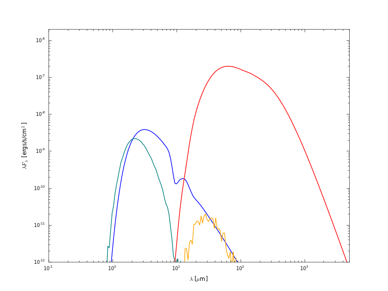
Now let’s do something a little more fancy. Assuming that you set up the SEDs with photon tracking:
sed.set_track_photon_origin('basic')
or:
sed.set_track_photon_origin('detailed')
you can plot the individual components. The following example retrieves each separate components, and plots it in a different color:
import matplotlib as mpl
mpl.use('Agg')
import matplotlib.pyplot as plt

from hyperion.model import ModelOutput
from hyperion.util.constants import pc

m = ModelOutput('tutorial_model.rtout')

fig = plt.figure()
ax = fig.add_subplot(1, 1, 1)

# Direct stellar photons
wav, nufnu = m.get_sed(inclination=0, aperture=-1, distance=300 * pc,
                       component='source_emit')
ax.loglog(wav, nufnu, color='blue')

# Scattered stellar photons
wav, nufnu = m.get_sed(inclination=0, aperture=-1, distance=300 * pc,
                       component='source_scat')
ax.loglog(wav, nufnu, color='teal')

# Direct dust photons
wav, nufnu = m.get_sed(inclination=0, aperture=-1, distance=300 * pc,
                       component='dust_emit')
ax.loglog(wav, nufnu, color='red')

# Scattered dust photons
wav, nufnu = m.get_sed(inclination=0, aperture=-1, distance=300 * pc,
                       component='dust_scat')
ax.loglog(wav, nufnu, color='orange')

ax.set_xlabel(r'$\lambda$ [$\mu$m]')
ax.set_ylabel(r'$\lambda F_\lambda$ [ergs/s/cm$^2$]')
ax.set_xlim(0.1, 5000.)
ax.set_ylim(1.e-12, 2.e-6)
fig.savefig('sed_origin.png')
This script produces the following plot: